2021 was a year of many changes for some brands, especially in terms of visual identity. You rebrandings they had a minimalist trend, and companies also opted for new logos that were more humanized and with a new look for the year to come.
Brands that changed their designs:
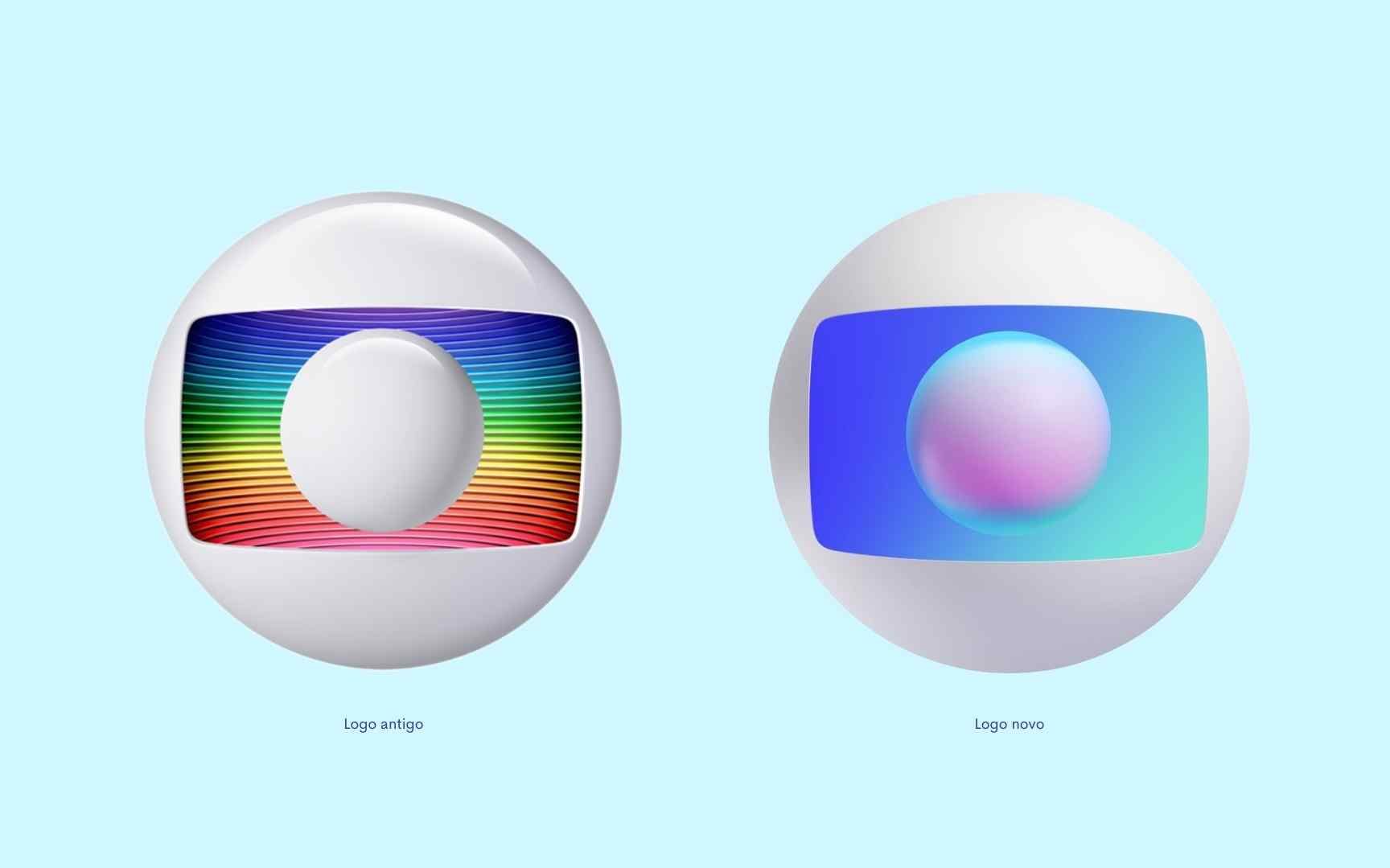
1 – TV Globo
the rebranding of TV Globo aimed to unify the company, from open TV, pay TV, streaming and digital platforms. In addition to the new visual identity, the company’s new logo was also presented, which has new, more creative and humanized colors.

2 – Burger King
The fast food company has had a major makeover in its logo. The new symbol of Burger King brings the minimalist concept and unique characteristics of the brand such as boldness, grandeur and quality ingredients, conveying the image of trust to consumers. In addition, the colors still refer to the meat being grilled over the fire.

3 – Nubank
The logo of Nubank, which was already minimalist, brought even more of this concept in the new form. According to the company itself, the curves that form the “nude” became less square to bring the idea of the human side. Also, the symbol is more fluid and there has been a slight change in the brand’s purple tone. Watch the video of the change:
4 – Point
Pontofrio was one of the brands that underwent the most changes in 2021: in addition to the new logo, the company was renamed Point :>. The intention was to bring a young, modern, simple and questioning language, which leads straight to the point and still has the stylized penguin (:>), in the place that used to be the word “cold”.

5 – Pringles
The traditional potato brand, Pringles, also reformulated the design: the new logo, which resembles an emoji, is minimalist, clean and dynamic. As the company had no changes in its visual identity for 20 years, the novelty divided consumers into those who liked it and those who didn’t.

The post The brands that changed their visual identity in 2021 appeared first on ADNEWS.


