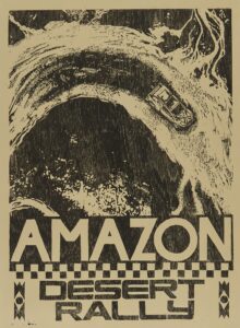
With the support and contribution of the indigenous Almir Narayamoga Surui, the “Amazon Desert Rally” campaign, created by the agency Africa and the visual arts studio Black Madre, provokes the population to look at the issue of deforestation and drought in northern Brazil
Have you ever imagined experiencing a rally in a place where there should be a river? This is what the ‘Amazon Desert Rally’ campaign, created by the agency Africa and by the visual arts studio Black Madre, brings to the population’s attention the issue of desertification in the Amazon.
Developed in partnership with the indigenous Almir Narayamoga Surui, from the Paiter Suruí tribe, who contributed to the creation and dialogue with other indigenous peoples, the piece uses images from a fictional rally within Roraima’s main river, the Rio Branco, which suffers with droughts, to draw attention and provoke a conversation around environmental problems in northern Brazil.
“The entire process was meticulously designed and thought out to look like a real race. We actually used rally cars driven by indigenous drivers and developed uniforms with teams to look like a high-performance race in a dry river to show that there shouldn’t be cars there but fauna and flora. There are many km of dry land, where it is even possible to see the piles of the bridges that connected one bank to the other. The situation is sad and urgent, so we want to call on people ‘not to sponsor this rally’, to act now to reverse this reality”, comments André Maciel, director and founding partner of Black Madre.
To carry out the campaign, an entire graphic communication was developed in the segment, with teams, symbols, signs, uniforms, car personalization, flags and others.
Furthermore, to intensify the message and make a movement against desertification, the visual arts studio Black Madre also created and produced 7 woodcut printed posters. With a language that brings simplicity combined with design sophistication to make this appeal, the message of the posters and the race were designed through a more graphic and direct aesthetic, elements very present in this relief engraving method, where the image is sculpted in a wooden matrix.
Plates measuring 1.20m x 1.75m were carved to be used in OOH communications (Photo: Disclosure)
“Mixing the simple language of woodcuts with more sophisticated design communication that ‘speaks’ directly is what creates the most interesting graphic effect for the project. When we print in woodcuts, in addition to the image itself, the matrix, as it is made of wood, carries the texture of the tree’s grain in it, an effect that we cannot control as it is something natural on the surface of the material. This in itself already carries meaning and creates an extraordinary layer in the final result. The most beautiful thing about this process is that it is organic and each ink to produce a print is unique, as the ink and the wood grain never behave in the same way. When printing, we only used one color and varied the color of the paper, which naturally gave us the color palette for the entire campaign. For this reason, each print is unique and made manually one by one”, concludes Maciel.
Follow Adnews on Instagram e LinkedIn. #WhereTransformationHappens


