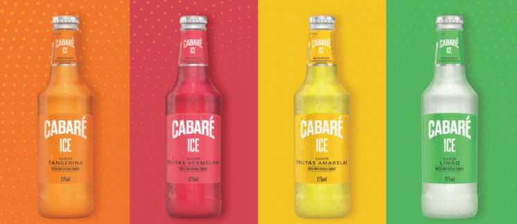
The drinks will be produced and bottled with the new visual identity from the second half of the year
Cabaré announced the new visual identity of the products with the aim of rejuvenating the brand’s image and strengthening the connection with the consumer.
Developed by the CasaCC studio, the rebranding is inspired by the 1920s and brings the product with elegant curves and ornaments that reflect exuberance, as well as new colors evoking a feeling of freshness, sophistication and tradition.
“The green flag is a direct allusion to nature and the natural ingredients of the beer, conveying an image of quality. The golden yellow, combined with green, directly refers to our Brazilianness and origin, giving personality to the brand. Graphite gray adds a note of elegance and modernity, while cream white suggests tradition and authenticity”, explains João Pedro Vargas, creative director and partner at the studio.
The new packaging has seals that reinforce the Brazilian essence. In pure malt beer, the highlighted attribute is 100% national production. In the Ice line, which has four flavors (tangerine, red fruits, yellow fruits and lemon), the highlight is the use of Cachaça Cabaré.
“For us, this brand rebranding represents a significant milestone. We want to encourage consumers to continue seeking premium experiences, while valuing the tradition and quality of our products”, says Bruna Alonso, premium brands manager at Grupo Petrópolis.
The Cabaré line products will be produced and packaged in new packaging at the Petrópolis Group factories, and will be available throughout the country from the second half of the year.


