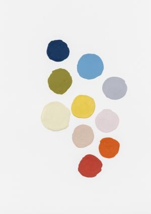
With the theme “Believe in a new vibration”, the tone “Golden Curry” was chosen
Coral has unveiled the colour that will govern the coming year with the theme “Believe in a new vibe” through ColourFutures 25. “Golden Curry” is a warm and vibrant yellow, capable of transforming any space and creating an authentic atmosphere full of personality.
“Our Color of the Year is surprising, it is our invitation for people to step out of their comfort zone. Yellows were very popular between 2007 and 2013. At that time, sunny colors became more prevalent, when people were looking for positivity in their homes. Now, once again, the movement is for a desire to start over and embrace the new, for a touch of color that brings joy to the walls and a smile to the face”, explains Priscila Perez, color activation manager for decorative paints in Brazil at AkzoNobel, manufacturer of Coral.
In addition, AkzoNobel has published a color and trend study, projecting the mood of the world as reflected in the dominant trends into color palettes. The “Fearless” palette includes bold and joyful colors that promote a surprising and spontaneous space to inspire and take us on an exciting journey outside of our current bubble. The colors are: Curry Gold, Basketball, Great Backlands, Coastal Beige, Frescobol, Place of Affection, Fresh Olive, Fascination, Panoramic Blue, Vibrant Navy.
The “Artisanal” palette re-embraces humanity and values the handmade. Craftsmanship implies deep wisdom, skill and thoughtful design, conveying a sense of authenticity and humanity. The colors that make up the palette are: Golden Curry, Winter Silence, Century Brown, Milk Tea, Authentic Brown, Manuscript, Quiet Hideaway, Roman Fog, Scottish Lowlands and Beautiful Heather.

The “Ancestrality” palette inspires us to revalue the surroundings and recognize the richness of our heritage. Inspired by earthy tones and natural dyes found around the world, the colors are: Golden Curry, Gravel River, Sculpted Stone, Bay Leaf, Date, Natural Lagoon, Dry Leaves, Mysterious Moonlight, Clay Pot and Minas Gerais Dulce de Leche.

“This year, the desire for liberation, a fresh start and embracing the new are at the heart of our research. That’s why we created a collection of colors that fills homes and spaces with creative energy, optimism, self-esteem and imagination. With our suggestions, we make it easier for people to take charge, experiment with confidence and create spaces that meet their individual needs. We invite consumers to delve into the palettes and insights behind our 2025 color collection, as well as ideas and inspiration for using the shades. In the coming months, you will be able to find inspiration on our social media, website and apps,” says Tamara Goes, marketing manager for decorative paints at AkzoNobel in Brazil.


